Recurring Gift Drop Down Formatting?
Options
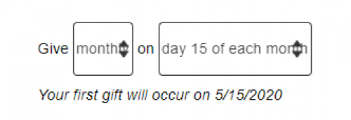
I am wondering if there is a way to change the way the menu options appear on OLX forms specifically when it comes to selecting recurring gifts options. I am including two screen shots below. The first is what the menu looks like in the form builder, easy to read. The second is how it renders on our Drupal website and you can see the drop down options are over the text and it generally looks yucky. Any advice or tricks?
OLX Form Builder View

Live Page

OLX Form Builder View

Live Page

Tagged:
0
Comments
-
Hi Dan Snyder. This is a little technical but hopefully it helps some. This looks like a bit of a collision between some of the CSS styling that the OLX loads with and some of the styling on your website. If I disable the two styles indicated in the image below coming from your website, the drop downs don't have the overlap with the arrows. Your Drupal site looks like it's overriding the default drop-down arrow look/feel and inserting the cool double arrow as a background image. But the way its implemented, the padding being applied to those form elements just doesn't leave enough space. The easiest CSS fix (if this is feasible for someone at your org to do) is probably to target those OLX form elements in your website's CSS and override the padding coming from the form's CSS and forcibly apply enough to give those arrows some room to breathe:

Thanks,
Chris Martin
Blackbaud Product Management
1 -
Thanks, Chris Martin. While I don't have the technical skills to execute the change I understand what you are saying and will pass it on to our web team.0
Categories
- All Categories
- Shannon parent
- shannon 2
- shannon 1
- 21 Advocacy DC Users Group
- 14 BBCRM PAG Discussions
- 89 High Education Program Advisory Group (HE PAG)
- 28 Luminate CRM DC Users Group
- 8 DC Luminate CRM Users Group
- Luminate PAG
- 5.9K Blackbaud Altru®
- 58 Blackbaud Award Management™ and Blackbaud Stewardship Management™
- 409 bbcon®
- 2K Blackbaud CRM™ and Blackbaud Internet Solutions™
- donorCentrics®
- 1.1K Blackbaud eTapestry®
- 2.8K Blackbaud Financial Edge NXT®
- 1.1K Blackbaud Grantmaking™
- 527 Education Management Solutions for Higher Education
- 1 JustGiving® from Blackbaud®
- 4.6K Education Management Solutions for K-12 Schools
- Blackbaud Luminate Online & Blackbaud TeamRaiser
- 16.4K Blackbaud Raiser's Edge NXT®
- 4.1K SKY Developer
- 547 ResearchPoint™
- 151 Blackbaud Tuition Management™
- 1 YourCause® from Blackbaud®
- 61 everydayhero
- 3 Campaign Ideas
- 58 General Discussion
- 115 Blackbaud ID
- 87 K-12 Blackbaud ID
- 6 Admin Console
- 949 Organizational Best Practices
- 353 The Tap (Just for Fun)
- 235 Blackbaud Community Feedback Forum
- 124 Ninja Secret Society
- 32 Blackbaud Raiser's Edge NXT® Receipting EAP
- 55 Admissions Event Management EAP
- 18 MobilePay Terminal + BBID Canada EAP
- 36 EAP for New Email Campaigns Experience in Blackbaud Luminate Online®
- 109 EAP for 360 Student Profile in Blackbaud Student Information System
- 41 EAP for Assessment Builder in Blackbaud Learning Management System™
- 9 Technical Preview for SKY API for Blackbaud CRM™ and Blackbaud Altru®
- 55 Community Advisory Group
- 46 Blackbaud Community Ideas
- 26 Blackbaud Community Challenges
- 7 Security Testing Forum
- 1.1K ARCHIVED FORUMS | Inactive and/or Completed EAPs
- 3 Blackbaud Staff Discussions
- 7.7K ARCHIVED FORUM CATEGORY [ID 304]
- 1 Blackbaud Partners Discussions
- 1 Blackbaud Giving Search™
- 35 EAP Student Assignment Details and Assignment Center
- 39 EAP Core - Roles and Tasks
- 59 Blackbaud Community All-Stars Discussions
- 20 Blackbaud Raiser's Edge NXT® Online Giving EAP
- Diocesan Blackbaud Raiser’s Edge NXT® User’s Group
- 2 Blackbaud Consultant’s Community
- 43 End of Term Grade Entry EAP
- 92 EAP for Query in Blackbaud Raiser's Edge NXT®
- 38 Standard Reports for Blackbaud Raiser's Edge NXT® EAP
- 12 Payments Assistant for Blackbaud Financial Edge NXT® EAP
- 6 Ask an All Star (Austen Brown)
- 8 Ask an All-Star Alex Wong (Blackbaud Raiser's Edge NXT®)
- 1 Ask an All-Star Alex Wong (Blackbaud Financial Edge NXT®)
- 6 Ask an All-Star (Christine Robertson)
- 21 Ask an Expert (Anthony Gallo)
- Blackbaud Francophone Group
- 22 Ask an Expert (David Springer)
- 4 Raiser's Edge NXT PowerUp Challenge #1 (Query)
- 6 Ask an All-Star Sunshine Reinken Watson and Carlene Johnson
- 4 Raiser's Edge NXT PowerUp Challenge: Events
- 14 Ask an All-Star (Elizabeth Johnson)
- 7 Ask an Expert (Stephen Churchill)
- 2025 ARCHIVED FORUM POSTS
- 322 ARCHIVED | Financial Edge® Tips and Tricks
- 164 ARCHIVED | Raiser's Edge® Blog
- 300 ARCHIVED | Raiser's Edge® Blog
- 441 ARCHIVED | Blackbaud Altru® Tips and Tricks
- 66 ARCHIVED | Blackbaud NetCommunity™ Blog
- 211 ARCHIVED | Blackbaud Target Analytics® Tips and Tricks
- 47 Blackbaud CRM Higher Ed Product Advisory Group (HE PAG)
- Luminate CRM DC Users Group
- 225 ARCHIVED | Blackbaud eTapestry® Tips and Tricks
- 1 Blackbaud eTapestry® Know How Blog
- 19 Blackbaud CRM Product Advisory Group (BBCRM PAG)
- 1 Blackbaud K-12 Education Solutions™ Blog
- 280 ARCHIVED | Mixed Community Announcements
- 3 ARCHIVED | Blackbaud Corporations™ & Blackbaud Foundations™ Hosting Status
- 1 npEngage
- 24 ARCHIVED | K-12 Announcements
- 15 ARCHIVED | FIMS Host*Net Hosting Status
- 23 ARCHIVED | Blackbaud Outcomes & Online Applications (IGAM) Hosting Status
- 22 ARCHIVED | Blackbaud DonorCentral Hosting Status
- 14 ARCHIVED | Blackbaud Grantmaking™ UK Hosting Status
- 117 ARCHIVED | Blackbaud CRM™ and Blackbaud Internet Solutions™ Announcements
- 50 Blackbaud NetCommunity™ Blog
- 169 ARCHIVED | Blackbaud Grantmaking™ Tips and Tricks
- Advocacy DC Users Group
- 718 Community News
- Blackbaud Altru® Hosting Status
- 104 ARCHIVED | Member Spotlight
- 145 ARCHIVED | Hosting Blog
- 149 JustGiving® from Blackbaud® Blog
- 97 ARCHIVED | bbcon® Blogs
- 19 ARCHIVED | Blackbaud Luminate CRM™ Announcements
- 161 Luminate Advocacy News
- 187 Organizational Best Practices Blog
- 67 everydayhero Blog
- 52 Blackbaud SKY® Reporting Announcements
- 17 ARCHIVED | Blackbaud SKY® Reporting for K-12 Announcements
- 3 Luminate Online Product Advisory Group (LO PAG)
- 81 ARCHIVED | JustGiving® from Blackbaud® Tips and Tricks
- 1 ARCHIVED | K-12 Conference Blog
- Blackbaud Church Management™ Announcements
- ARCHIVED | Blackbaud Award Management™ and Blackbaud Stewardship Management™ Announcements
- 1 Blackbaud Peer-to-Peer Fundraising™, Powered by JustGiving® Blogs
- 39 Tips, Tricks, and Timesavers!
- 56 Blackbaud Church Management™ Resources
- 154 Blackbaud Church Management™ Announcements
- 1 ARCHIVED | Blackbaud Church Management™ Tips and Tricks
- 11 ARCHIVED | Blackbaud Higher Education Solutions™ Announcements
- 7 ARCHIVED | Blackbaud Guided Fundraising™ Blog
- 2 Blackbaud Fundraiser Performance Management™ Blog
- 9 Foundations Events and Content
- 14 ARCHIVED | Blog Posts
- 2 ARCHIVED | Blackbaud FIMS™ Announcement and Tips
- 59 Blackbaud Partner Announcements
- 10 ARCHIVED | Blackbaud Impact Edge™ EAP Blogs
- 1 Community Help Blogs
- Diocesan Blackbaud Raiser’s Edge NXT® Users' Group
- Blackbaud Consultant’s Community
- Blackbaud Francophone Group
- 1 BLOG ARCHIVE CATEGORY
- Blackbaud Community™ Discussions
- 8.3K Blackbaud Luminate Online® & Blackbaud TeamRaiser® Discussions
- 5.7K Jobs Board


