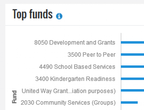
Tops funds missing
Comments
-
That's very odd. I just checked this out and it's not happening to me. I also tried to change the screen size, but it just adds scroll bars, doesn't compress farthur and then drop out some labels. I do like that it replaces the center of long text strings with ellipses (2nd from the bottom in my screenshot below). If no one else pipes up with the same thing you're seeing, I'd ask BB because there might be something up with your database itself. Do you have a lot of Funds that are similar in their totals, that the system can only show so many, but because there are several "ties" it has to compress the data rather than expand the graph?

0 -
Hey, still experiencing this issue and haven't heard from anyone else. If we have a community manager checking on topics, I'd love to hear from that person about this. Otherwise yes, I'll reach out to BB Support. Thanks, Jen, for your feedback.Jen Claudy:
That's very odd. I just checked this out and it's not happening to me. I also tried to change the screen size, but it just adds scroll bars, doesn't compress farthur and then drop out some labels. I do like that it replaces the center of long text strings with ellipses (2nd from the bottom in my screenshot below). If no one else pipes up with the same thing you're seeing, I'd ask BB because there might be something up with your database itself. Do you have a lot of Funds that are similar in their totals, that the system can only show so many, but because there are several "ties" it has to compress the data rather than expand the graph?
0 -
Kate Kiser:
Hey, still experiencing this issue and haven't heard from anyone else. If we have a community manager checking on topics, I'd love to hear from that person about this. Otherwise yes, I'll reach out to BB Support. Thanks, Jen, for your feedback.Jen Claudy:
That's very odd. I just checked this out and it's not happening to me. I also tried to change the screen size, but it just adds scroll bars, doesn't compress farthur and then drop out some labels. I do like that it replaces the center of long text strings with ellipses (2nd from the bottom in my screenshot below). If no one else pipes up with the same thing you're seeing, I'd ask BB because there might be something up with your database itself. Do you have a lot of Funds that are similar in their totals, that the system can only show so many, but because there are several "ties" it has to compress the data rather than expand the graph?
Hey Kate- To fit a large number of funds, the metric may start to omit descriptions — but not the funds themselves, based on their bars in the chart — for legibility (similar to what Jen suggested earlier). As you discovered, each bar itself can provide information about its respective fund, even when its description doesn't appear. If you want to view all the fund descriptions in addition to their bars, you may want to use the filters to group and analyze the funds in different contexts. Hope that helps! Thanks!
0 -
I understand why descriptions would need to be omitted for the chart design, but why not remove the bottom ones? At least the top 5 should include the descriptions. Currently, my management team is not hovering over the bars to see the fund names...they are looking where their eyes are directed, which is to the left of the chart where the descriptions are. If we were to apply filters, we'd have to pick each fund we'd want to see and for orgs that have 100+ funds, that's not feasible in filters.2
-
With a Tile named "Top Funds", I would expect it to show the top X number of funds. No need to omit any labels, as the Tile is designed to show X number of funds, and shows X number of funds. Maybe with a [See All] link that goes to a full page report showing all Funds (with filters, if they're helpful).2
-
Great feedback and ideas, Kate and Jen! Might be worthwhile to post those in the Idea Bank to see which resonates most with others, which will help determine the route we go in the future. Thanks!0
-
I did move this feedback over to the Idea Bank. Vote here: https://renxt.ideas.aha.io/ideas/RENXT-I-4940
Categories
- All Categories
- Shannon parent
- shannon 2
- shannon 1
- 21 Advocacy DC Users Group
- 14 BBCRM PAG Discussions
- 89 High Education Program Advisory Group (HE PAG)
- 28 Luminate CRM DC Users Group
- 8 DC Luminate CRM Users Group
- Luminate PAG
- 5.9K Blackbaud Altru®
- 58 Blackbaud Award Management™ and Blackbaud Stewardship Management™
- 409 bbcon®
- 2.1K Blackbaud CRM™ and Blackbaud Internet Solutions™
- donorCentrics®
- 1.1K Blackbaud eTapestry®
- 2.8K Blackbaud Financial Edge NXT®
- 1.1K Blackbaud Grantmaking™
- 527 Education Management Solutions for Higher Education
- 1 JustGiving® from Blackbaud®
- 4.6K Education Management Solutions for K-12 Schools
- Blackbaud Luminate Online & Blackbaud TeamRaiser
- 16.4K Blackbaud Raiser's Edge NXT®
- 4.1K SKY Developer
- 547 ResearchPoint™
- 151 Blackbaud Tuition Management™
- 1 YourCause® from Blackbaud®
- 61 everydayhero
- 3 Campaign Ideas
- 58 General Discussion
- 115 Blackbaud ID
- 87 K-12 Blackbaud ID
- 6 Admin Console
- 949 Organizational Best Practices
- 353 The Tap (Just for Fun)
- 235 Blackbaud Community Feedback Forum
- 55 Admissions Event Management EAP
- 18 MobilePay Terminal + BBID Canada EAP
- 36 EAP for New Email Campaigns Experience in Blackbaud Luminate Online®
- 109 EAP for 360 Student Profile in Blackbaud Student Information System
- 41 EAP for Assessment Builder in Blackbaud Learning Management System™
- 9 Technical Preview for SKY API for Blackbaud CRM™ and Blackbaud Altru®
- 55 Community Advisory Group
- 46 Blackbaud Community Ideas
- 26 Blackbaud Community Challenges
- 7 Security Testing Forum
- 1.1K ARCHIVED FORUMS | Inactive and/or Completed EAPs
- 3 Blackbaud Staff Discussions
- 7.7K ARCHIVED FORUM CATEGORY [ID 304]
- 1 Blackbaud Partners Discussions
- 1 Blackbaud Giving Search™
- 35 EAP Student Assignment Details and Assignment Center
- 39 EAP Core - Roles and Tasks
- 59 Blackbaud Community All-Stars Discussions
- 20 Blackbaud Raiser's Edge NXT® Online Giving EAP
- Diocesan Blackbaud Raiser’s Edge NXT® User’s Group
- 2 Blackbaud Consultant’s Community
- 43 End of Term Grade Entry EAP
- 92 EAP for Query in Blackbaud Raiser's Edge NXT®
- 38 Standard Reports for Blackbaud Raiser's Edge NXT® EAP
- 12 Payments Assistant for Blackbaud Financial Edge NXT® EAP
- 6 Ask an All Star (Austen Brown)
- 8 Ask an All-Star Alex Wong (Blackbaud Raiser's Edge NXT®)
- 1 Ask an All-Star Alex Wong (Blackbaud Financial Edge NXT®)
- 6 Ask an All-Star (Christine Robertson)
- 21 Ask an Expert (Anthony Gallo)
- Blackbaud Francophone Group
- 22 Ask an Expert (David Springer)
- 4 Raiser's Edge NXT PowerUp Challenge #1 (Query)
- 6 Ask an All-Star Sunshine Reinken Watson and Carlene Johnson
- 4 Raiser's Edge NXT PowerUp Challenge: Events
- 14 Ask an All-Star (Elizabeth Johnson)
- 7 Ask an Expert (Stephen Churchill)
- 2025 ARCHIVED FORUM POSTS
- 322 ARCHIVED | Financial Edge® Tips and Tricks
- 164 ARCHIVED | Raiser's Edge® Blog
- 300 ARCHIVED | Raiser's Edge® Blog
- 441 ARCHIVED | Blackbaud Altru® Tips and Tricks
- 66 ARCHIVED | Blackbaud NetCommunity™ Blog
- 211 ARCHIVED | Blackbaud Target Analytics® Tips and Tricks
- 47 Blackbaud CRM Higher Ed Product Advisory Group (HE PAG)
- Luminate CRM DC Users Group
- 225 ARCHIVED | Blackbaud eTapestry® Tips and Tricks
- 1 Blackbaud eTapestry® Know How Blog
- 19 Blackbaud CRM Product Advisory Group (BBCRM PAG)
- 1 Blackbaud K-12 Education Solutions™ Blog
- 280 ARCHIVED | Mixed Community Announcements
- 3 ARCHIVED | Blackbaud Corporations™ & Blackbaud Foundations™ Hosting Status
- 1 npEngage
- 24 ARCHIVED | K-12 Announcements
- 15 ARCHIVED | FIMS Host*Net Hosting Status
- 23 ARCHIVED | Blackbaud Outcomes & Online Applications (IGAM) Hosting Status
- 22 ARCHIVED | Blackbaud DonorCentral Hosting Status
- 14 ARCHIVED | Blackbaud Grantmaking™ UK Hosting Status
- 117 ARCHIVED | Blackbaud CRM™ and Blackbaud Internet Solutions™ Announcements
- 50 Blackbaud NetCommunity™ Blog
- 169 ARCHIVED | Blackbaud Grantmaking™ Tips and Tricks
- Advocacy DC Users Group
- 718 Community News
- Blackbaud Altru® Hosting Status
- 104 ARCHIVED | Member Spotlight
- 145 ARCHIVED | Hosting Blog
- 149 JustGiving® from Blackbaud® Blog
- 97 ARCHIVED | bbcon® Blogs
- 19 ARCHIVED | Blackbaud Luminate CRM™ Announcements
- 161 Luminate Advocacy News
- 187 Organizational Best Practices Blog
- 67 everydayhero Blog
- 52 Blackbaud SKY® Reporting Announcements
- 17 ARCHIVED | Blackbaud SKY® Reporting for K-12 Announcements
- 3 Luminate Online Product Advisory Group (LO PAG)
- 81 ARCHIVED | JustGiving® from Blackbaud® Tips and Tricks
- 1 ARCHIVED | K-12 Conference Blog
- Blackbaud Church Management™ Announcements
- ARCHIVED | Blackbaud Award Management™ and Blackbaud Stewardship Management™ Announcements
- 1 Blackbaud Peer-to-Peer Fundraising™, Powered by JustGiving® Blogs
- 39 Tips, Tricks, and Timesavers!
- 56 Blackbaud Church Management™ Resources
- 154 Blackbaud Church Management™ Announcements
- 1 ARCHIVED | Blackbaud Church Management™ Tips and Tricks
- 11 ARCHIVED | Blackbaud Higher Education Solutions™ Announcements
- 7 ARCHIVED | Blackbaud Guided Fundraising™ Blog
- 2 Blackbaud Fundraiser Performance Management™ Blog
- 9 Foundations Events and Content
- 14 ARCHIVED | Blog Posts
- 2 ARCHIVED | Blackbaud FIMS™ Announcement and Tips
- 59 Blackbaud Partner Announcements
- 10 ARCHIVED | Blackbaud Impact Edge™ EAP Blogs
- 1 Community Help Blogs
- Diocesan Blackbaud Raiser’s Edge NXT® Users' Group
- Blackbaud Consultant’s Community
- Blackbaud Francophone Group
- 1 BLOG ARCHIVE CATEGORY
- Blackbaud Community™ Discussions
- 8.3K Blackbaud Luminate Online® & Blackbaud TeamRaiser® Discussions
- 5.7K Jobs Board


