Power BI line and clustered column chart


Power BI question: I have a line and clustered column chart and I want the line to be a constant - a value I need to calculate based on filters and averaging. I have created a summary table with the value in it, but since it has only that value, I can't connect it to anything in the data model. I have also tried creating a measure. When I pull the value onto a card, the measure value is constant and correct. When I pull it into the line and clustered column chart, it is no longer a constant line, instead changes based on each column it is over. Anyone have a better idea?
Comments
-
@Laura Hill
going to need to understand what you are trying to display in order to help.what does the line represent? what does the column represent? what data and how are they related?
0 -
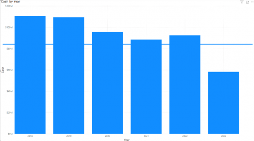
@Alex Wong the columns represent both YTD dollars raised and YTD cash in for the past 4 fiscal years and the current fiscal year. The static line(s), there are actually going to be two, represent the average YTD dollars raised and the average YTD cash in over the last 4 fiscal years (not including current).
0 -
@Laura Hill
so the line (average) is average of YTD giving of the last 4 years? not average giving of the respective year?Today is 6/18 for example, is your average cash the average cash of all gifts from 1/1/20-6/18/20, 1/1/21-6/18/21, 1/1/22-6/18/22, 1/1/23-6/18/23 or is your average = average cash of 1/1/20-12/31/23
Did you use measure? or calcuated column? Measure is going to take the filtering context (not sure if i'm saying this correctly), so a chart that has year on the X axis, your normal average measure will be average of gifts for that year.
0 -
@Alex Wong my comparison date for this report is January 15, 2024 because I am using static data to try to learn how to build these visualizations. I want to sum all gifts (with some filters in place) from 7-1-2019 to 1-15-2020 (my first column) + gifts from 7-1-2020 to 1-15-2021 (my second column) + gifts from 7-15-2021 - 1-15-2022 (my third column) + gifts from 7-1-2022 to 1-15-2023 (my 4th column) and divide by 4. However, I will have a 5th column for current year (for this example: 7-1-2023 to 1-15-2024) but I don't want gifts during those dates included in the average.
0 -
@Laura Hill
what you are trying to do is not familiar to me on building various visualizations.I don't know if there are other Power BI expert that's wiling to chrime in, but I think you will not want to use a measure in this case, (or maybe measure that does not take “date filter” into context consideration).
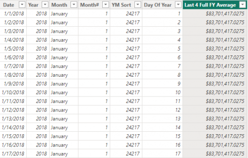
Meaning, create a calculated column in the date table that puts the 4 year average as a column for all date.
Last 4 Full FY Average =
VAR TY = YEAR(TODAY())
VAR TYm1 = CALCULATE([Cash], FILTER('Date Table', [Year]=TY-1))
VAR TYm2 = CALCULATE([Cash], FILTER('Date Table', [Year]=TY-2))
VAR TYm3 = CALCULATE([Cash], FILTER('Date Table', [Year]=TY-3))
VAR TYm4 = CALCULATE([Cash], FILTER('Date Table', [Year]=TY-4))
RETURN (TYm1+TYm2+TYm3+TYm4)/4
my giving data is year based, you can change the above to FY.
then create a separate line chart that has transparent background on top of the bar chart.
This is LIKELY not the best way to do this though.
0 -
@Alex Wong Thank you.
0


Categories
- All Categories
- 6 Blackbaud Community Help
- High Education Program Advisory Group (HE PAG)
- BBCRM PAG Discussions
- Luminate CRM DC Users Group
- DC Luminate CRM Users Group
- Luminate PAG
- 186 bbcon®
- 1.4K Blackbaud Altru®
- 389 Blackbaud Award Management™ and Blackbaud Stewardship Management™
- 1K Blackbaud CRM™ and Blackbaud Internet Solutions™
- 14 donorCentrics®
- 355 Blackbaud eTapestry®
- 2.4K Blackbaud Financial Edge NXT®
- 616 Blackbaud Grantmaking™
- 542 Blackbaud Education Management Solutions for Higher Education
- 33 Blackbaud Impact Edge™
- 3.1K Blackbaud Education Management Solutions for K-12 Schools
- 909 Blackbaud Luminate Online® and Blackbaud TeamRaiser®
- 207 JustGiving® from Blackbaud®
- 6.2K Blackbaud Raiser's Edge NXT®
- 3.5K SKY Developer
- 236 ResearchPoint™
- 116 Blackbaud Tuition Management™
- 375 YourCause® from Blackbaud®
- 160 Organizational Best Practices
- 232 The Tap (Just for Fun)
- 31 Blackbaud Community Challenges
- Blackbaud Consultant’s Community
- 19 PowerUp Challenges
- 3 Raiser's Edge NXT PowerUp Challenge: Gift Management
- 4 Raiser's Edge NXT PowerUp Challenge: Events
- 3 Raiser's Edge NXT PowerUp Challenge: Home Page
- 4 Raiser's Edge NXT PowerUp Challenge: Standard Reports
- 4 Raiser's Edge NXT PowerUp Challenge #1 (Query)
- 71 Blackbaud Community All-Stars Discussions
- 47 Blackbaud CRM Higher Ed Product Advisory Group (HE PAG)
- 743 Community News
- 2.8K Jobs Board
- Community Help Blogs
- 52 Blackbaud SKY® Reporting Announcements
- Blackbaud Consultant’s Community
- 19 Blackbaud CRM Product Advisory Group (BBCRM PAG)
- Blackbaud Francophone Group
- Blackbaud Community™ Discussions
- Blackbaud Francophone Group