PowerBI Bar Chart - Creating a Data Label
Options


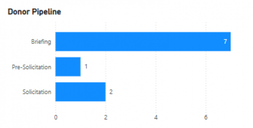
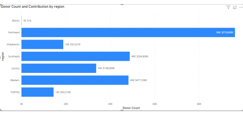
Hello! I have a bar chart in PowerBI that has Opportunity Status on the Y-Axis. And a Measure -Count of Donor on the X-Axis. This is based on data from an Opportunity table and shows us how many donors are in each status.
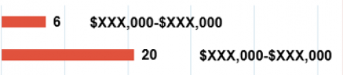
I would like to incorporate an additional label to the right of the bar showing (Sum Amount Expected - Sum Amount Asked) to capture the range of the $$ impact at each status. I can pull in the $ value onto the X-Axis, but then it gets too busy and distracting. Example of the end result I'm looking for is also pasted below. Any ideas?! Thanks!
Tagged:
0
Comments
-
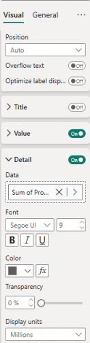
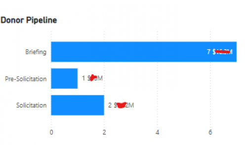
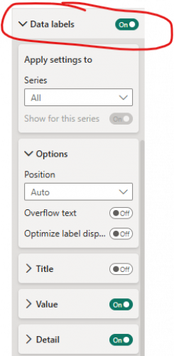
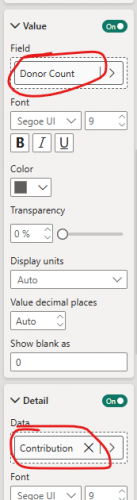
@Molly Glowacki Adding that I can add one data label within the Visual Formatting > Detail. this may be enough, but curious about creating my original request of a range.
 0
0 -
1


Categories
- All Categories
- High Education Program Advisory Group (HE PAG)
- BBCRM PAG Discussions
- Luminate CRM DC Users Group
- DC Luminate CRM Users Group
- Luminate PAG
- 186 bbcon®
- 1.4K Blackbaud Altru®
- 60 Blackbaud Award Management™ and Blackbaud Stewardship Management™
- 1.2K Blackbaud CRM™ and Blackbaud Internet Solutions™
- donorCentrics®
- 361 Blackbaud eTapestry®
- 2.4K Blackbaud Financial Edge NXT®
- 616 Blackbaud Grantmaking™
- 542 Blackbaud Education Management Solutions for Higher Education
- 3.1K Blackbaud Education Management Solutions for K-12 Schools
- Blackbaud Luminate Online® and Blackbaud TeamRaiser®
- 75 Blackbaud Community Help Page
- JustGiving® from Blackbaud®
- 6.2K Blackbaud Raiser's Edge NXT®
- 3.5K SKY Developer
- 262 ResearchPoint™
- 116 Blackbaud Tuition Management™
- 160 Organizational Best Practices
- 232 The Tap (Just for Fun)
- 30 Blackbaud Community Challenges
- Blackbaud Consultant’s Community
- 18 PowerUp Challenges
- 3 Raiser's Edge NXT PowerUp Challenge: Gift Management
- 4 Raiser's Edge NXT PowerUp Challenge: Events
- 3 Raiser's Edge NXT PowerUp Challenge: Home Page
- 4 Raiser's Edge NXT PowerUp Challenge: Standard Reports
- 4 Raiser's Edge NXT PowerUp Challenge #1 (Query)
- 71 Blackbaud Community All-Stars Discussions
- 47 Blackbaud CRM Higher Ed Product Advisory Group (HE PAG)
- 743 Community News
- 2.8K Jobs Board
- Community Help Blogs
- 52 Blackbaud SKY® Reporting Announcements
- Blackbaud Consultant’s Community
- 19 Blackbaud CRM Product Advisory Group (BBCRM PAG)
- Blackbaud Francophone Group
- Blackbaud Community™ Discussions
- Blackbaud Francophone Group